

Monday Marks: #21
CLIENT
The Play Cafe, Bryn Mawr, PA
CREATIVE BRIEF
Create a visual identity for The Play Café, a 4,000 square foot indoor play space for children (age 5 and under) and their caregivers. Visitors can play, relax, eat, learn, and party. We want The Play Café to be known as a safe and comfortable place where happiness is ensured. The identity should be simple and easily recognizable by kids and adults. It should be modern, classy, and clean—bearing no resemblance to a daycare center, Chuck E. Cheese or a hypodermic infested ball pit. We want a hip graphic identity that can visually influence both the physical and virtual (website) space.
DESIGN RESPONSE
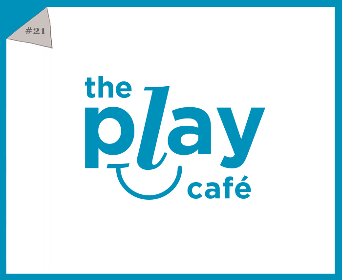
Using type, we created an anthropomorphic mark that displays the company name. It features the word “play” at its center which we feel appropriately underscores their awesome mission. The foundation of the graphic mark is a smile line which is thread through numerous icons to promote their offerings. Bottom line: There’s a lot to smile about at The Play Café.
The playful orange, blue, and yellow palette is injected into the website and the physical location creating a vibrant and warm environment. We developed the tagline “come out + play!” which is what the logo would say if it could talk (wink). It is an open invitation to the public to enter the space and smile.
re-MARKS:
“It is amazing that you can take my words and make them into something visual.”
“… go with the ‘smile’ design. I love everything about it.”
—Lauren Ainsworth, owner
![]()
Monday Marks: Every Monday, for twenty-one consecutive weeks, we’ll be blogging about a graphic mark designed by our creative team. We’ll reveal the meaning and inspiration and share the many questions that each mark seeks to answer. The series begins on our 21st birthday, May 19, 2014. BookMARK our blog and see how we have made our mark!
Tags: retail, The Play Cafe