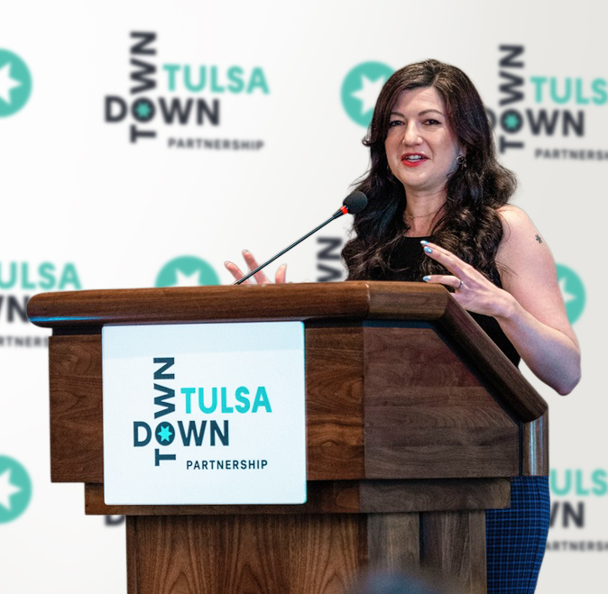
In 2021, DTP was created to promote, preserve, and extend the vibrancy, safety, and economic vitality of Downtown Tulsa. As a new organization, it needed a strong visual brand. The biggest challenge: there are eight districts, each with a unique identity. Our charge was to create a unifying umbrella brand, to support but not compete with the districts, and reflect the essence of downtown.


Our wordmark is inspired by streets coming together—the intersection of districts, people, events, and opportunities. The shared “O” is the creative focal point. It signifies the spark that is ignited when Tulsans come together. The word “down” elevates Tulsa—a nod to a downtown that is advancing and building upward. The star, drawn from the iconic Tulsa flag, connects to the city at large. The unique palette is inspired by the colorful landscape.


Branding
Messaging
Visual Identity
Communication Suite
Launch Plan
Publication Design
Marketing Campaigns
Event Branding
Collaborator: En Route Marketing, brand research, discovery, messaging and launch plan
Photo: District 4 Tulsa City Councilor Laura Bellis
